Speculative Design
Heterosis: Designing a typeface in the third space

12.1.25
/
12-15 min
Brian Banton
Share Article
1. A Project With No Brief
Lately I’ve found myself returning to a project I completed back in 2010—long before my partner and I started Plan of Record, our design studio. As I help build the studio and think more deliberately about what drives my passion for design, I’ve realized that some of my most formative ideas were seeded much earlier. Running Plan of Record forces me to confront not just what we can deliver for clients, but what themes genuinely motivate me, what questions keep resurfacing, and what personal experiences continue to shape my creative instincts. Revisiting this early project became a way of reconnecting with those roots and understanding how they might inform both the studio’s direction and the work we take on.
That project originated, somewhat unknowingly, from my own lived experience. Growing up biracial—Scottish and Jamaican—in Brampton, Ontario, I was constantly navigating shifting identity scripts. People read me differently depending on context; I shifted my own behavior in response. I sensed early on that identity wasn’t fixed but something continuously negotiated—though at the time, I didn’t have the vocabulary for what I was experiencing.
It wasn’t until graduate school that I began to understand the deeper cultural mechanics behind those early sensations. Through theory courses, I encountered thinkers who interrogated how identity is constructed through representation—how images and narratives don’t simply reflect reality but actively shape it. Out of that exploration emerged the question that would eventually anchor my MDes thesis: How do representations of racial identity shape our understanding of race? For the first time, I had the conceptual tools to articulate something I had intuitively felt my whole life: that design and visual culture play a profound role in determining which identities are legible, which are marginalized, and which are erased altogether.
This question would eventually become the foundation of the project I later titled Heterosis. Returning to it now, after years of practice, I can see how deeply it continues to resonate—not just as an academic inquiry, but as a guiding force in my broader approach to design.
2. The Early Archive: Learning Race Through Media
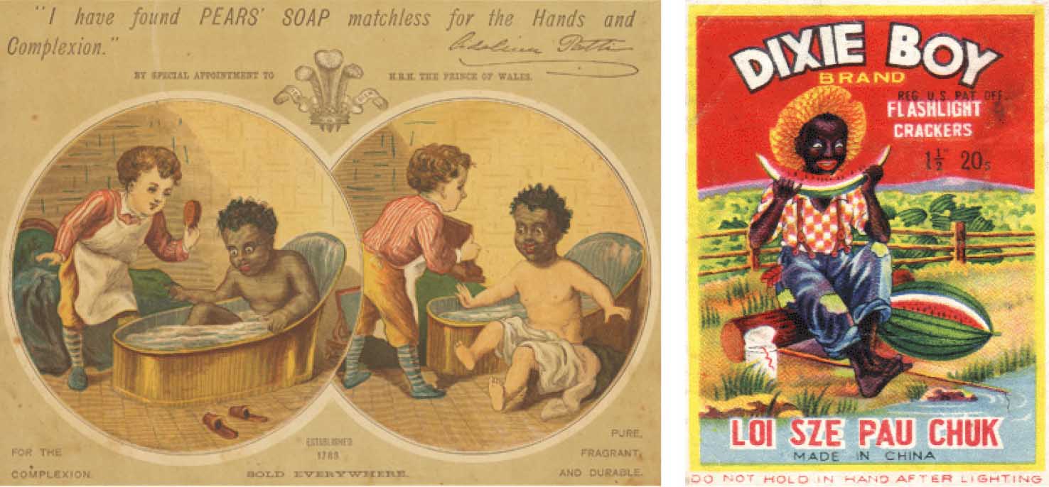
Researching racial representation in graduate school brought me face-to-face with 19th- and early 20th-century advertisements and packaging—objects that used overt caricature to define racial categories. These archival materials were stark in their simplicity: Blackness rendered as servile, childish, or monstrous; whiteness depicted as pure, civilized, or aspirational. Although these images were not part of my childhood, they helped illuminate the historical visual systems that continue to shape cultural perception.
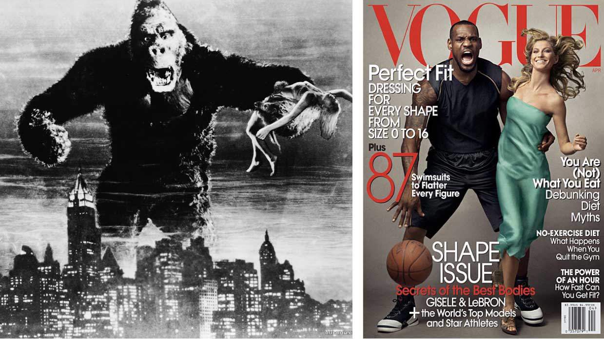
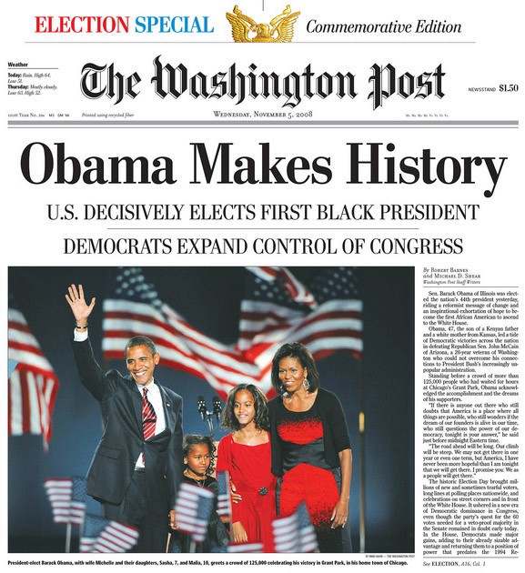
What I did grow up with were the pop-culture caricatures of the 1980s and 1990s: the hyper-masculine Black archetype embodied by Mr. T; a steady diet of white male heroes; and non-white characters relegated to villains, comic relief, or background roles. These representations were less crude than the historical examples, but they operated with similar logic—flattening identities into recognizable, consumable stereotypes. And even in what many described as a “post-racial” Obama-era America, these tropes persisted. A striking example was the 2008 Annie Leibovitz Vogue cover depicting LeBron James in a visual trope reminiscent of King Kong clutching Fay Wray—a composition that reinscribed the “Black Man as Monster” stereotype onto one of the most visible athletes in the world. Seeing that image made it clear that even celebrated, mainstream media continued to lean on deeply problematic visual narratives.
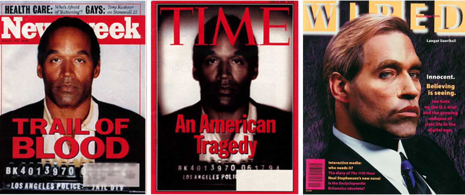
As a teenager in the ’90s, the O.J. Simpson trial became a turning point in my awareness of how powerful media truly was. The infamous TIME and WIRED covers presented manipulated images of Simpson—TIME darkening his mugshot to make him appear more ominous and criminal, WIRED rendering him as a suave white man with the cheeky headline "Innocent. Believing is seeing". Seeing those two drastically different interpretations of Simpson made something click: media doesn’t simply document identity; it constructs it.
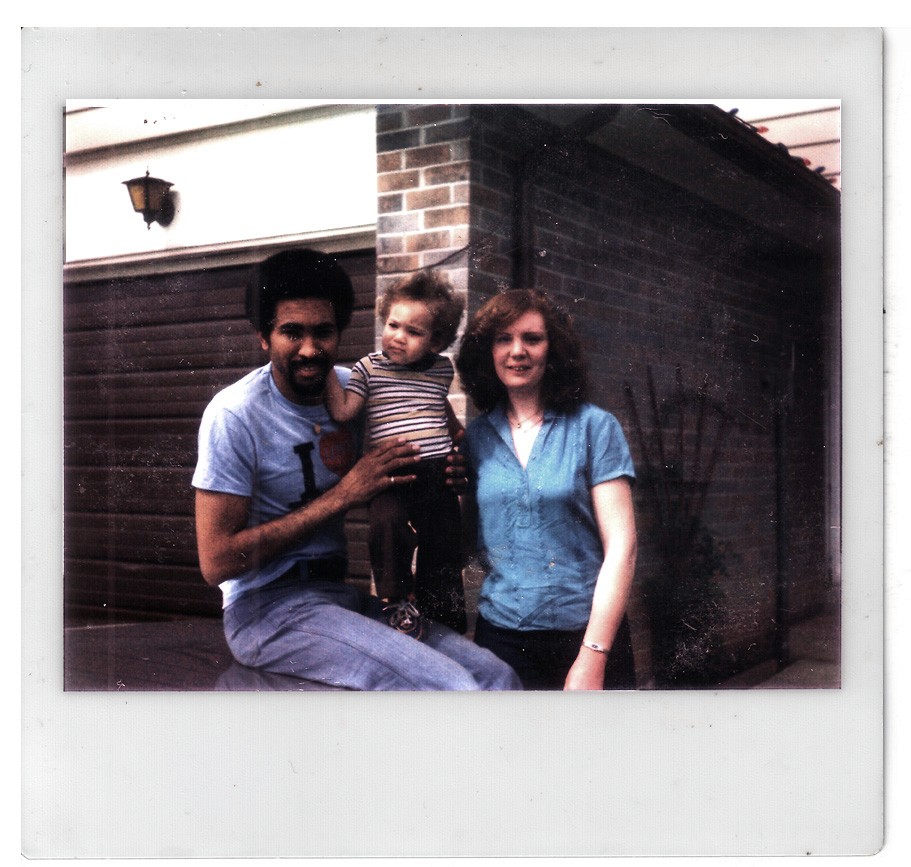
For me, this realization collided with the reality of my own family. My Scottish relatives didn’t resemble the romanticized imagery of whiteness I saw in the media; my Jamaican relatives didn’t match the narrow cultural scripts of Blackness. The place where these identities met—my own mixed background—was almost entirely absent from representation. Growing up mixed meant learning to navigate the gap between lived experience and the limited imagery available in popular culture.
3. Performing Race
Because my parents separated when I was young, I spent time immersed in both my Scottish and Jamaican families. Each environment was loving and familiar, but each carried different cultural cues. Without fully realizing it, I learned to perform aspects of each identity depending on which side of the family I was with. These performances weren’t inauthentic—they were adaptations, ways of fitting into two worlds that didn’t always speak to each other.
Outside of family, those pressures became even more complicated. Since I mostly pass for white, people often didn’t perceive my background unless I told them. And when I did, I sometimes felt the need to “prove” my Blackness—to signal it more clearly so that others would accept my biracial identity as legitimate. That dynamic—trying to convince people of something true but invisible—was emotionally taxing in ways I didn’t have language for at the time.
During my research, I came across Claude Steele and Joshua Aronson’s landmark study Stereotype Threat and the Intellectual Test, which describes how confronting stereotypes can affect performance, behavior, and self-perception. The study confirmed something I had long felt intuitively: the burden of performing and negotiating between identities has real psychological consequences. This burden isn’t merely personal; it’s structural, reinforced by the cultural imagery and narratives we internalize.
Reflecting on the hyper-caricatured media of my childhood, I began to see how powerfully manipulative visual culture can be—and how deeply it shapes the self-image of those who don’t see themselves represented with nuance or accuracy. That tension—between lived identity and cultural representation—became a key emotional driver behind Heterosis.
4. Why Is Race Always Black and White?
One idea that emerged again and again in my research was how little room our culture makes for the ambiguity of mixed-race identity. Binary systems—Black/white, us/them—create the illusion of stability. They offer tidy categories that comfort people by implying clear boundaries where, in reality, there are none. But these binaries leave almost no space for identities that exist between or across them.
Julia Kristeva’s writing on abjection in Powers of Horror provided a crucial lens for understanding this tension. Abjection describes the discomfort, even revulsion, triggered by things that blur boundaries or disrupt established categories. It helped explain why public figures like Barack Obama or Halle Berry—both biracial—are commonly understood as solely Black. Hybridity complicates the binary, so culture resolves the discomfort by collapsing mixed identity into one side of the divide.
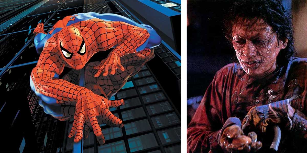
Once I saw this dynamic, I began noticing how myths and stories treat hybridity. Hybrid figures are almost never ordinary humans—they become either superheroes or monsters. Characters like Spider-Man and Hercules gain power through their hybrid origins. Meanwhile, Cronenberg’s The Fly and tabloid icons like Batboy embody the fears and anxieties associated with boundary-crossing. Hybridity is seen as extraordinary or aberrant—but rarely simply human.
These mythologies echoed the experiences of mixed-race individuals. They revealed how deeply the discomfort with hybridity runs in our culture—and why mixed identity often lacks nuanced representation. This inquiry into the cultural symbolism of hybridity directly informed the conceptual foundations of Heterosis.
5. Turning Identity Into a Design Problem
As I explored these themes, I began to see hybridity not just as a cultural issue but as a design challenge. If mixed identity destabilizes categories, then how do you design that destabilization? How do you create visual systems that reflect ambiguity rather than suppress it?
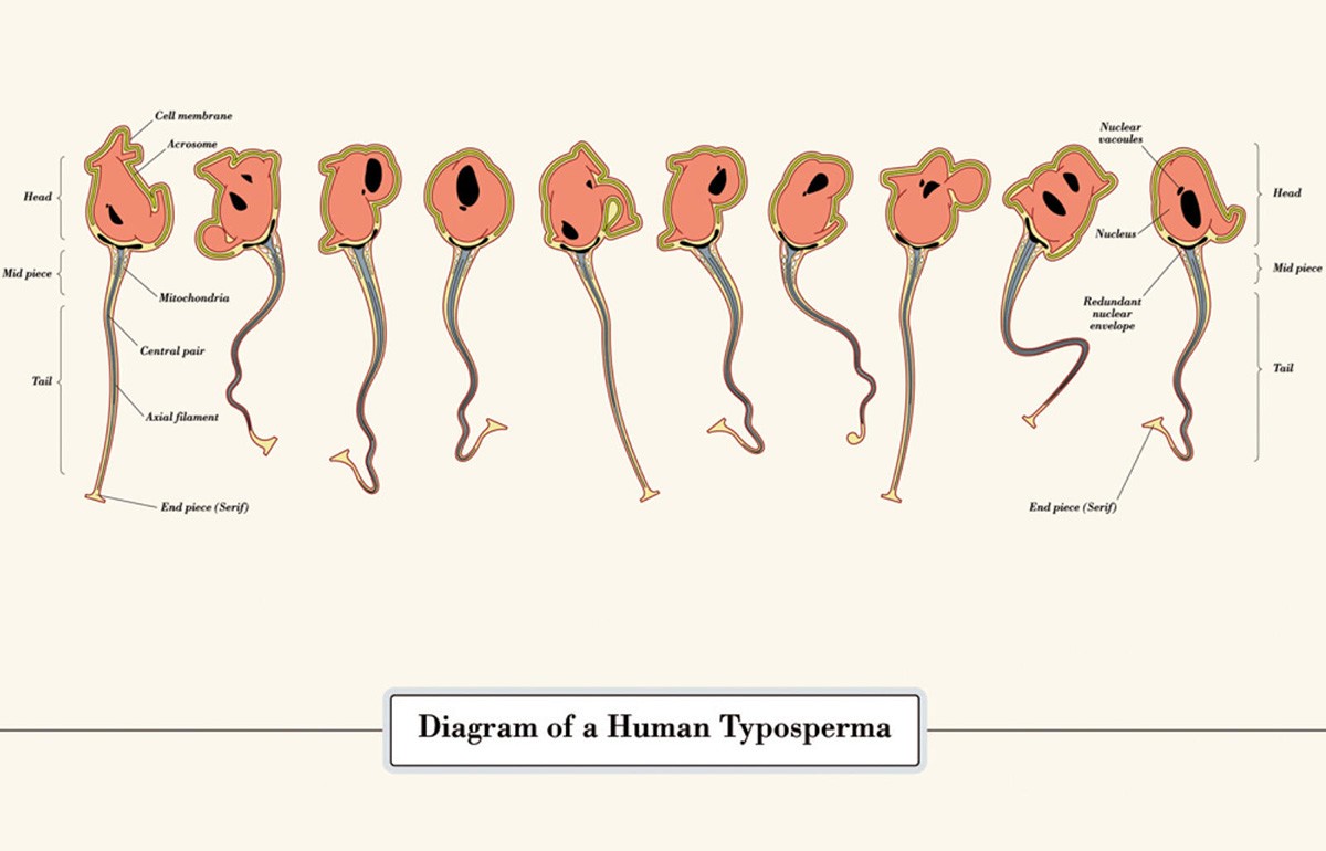
Discovering Oded Ezer’s experimental work—particularly Typosperma—was a breakthrough. Ezer treated typography as if it were biological matter, something capable of mutation and evolution. His work didn’t just inspire me aesthetically; it expanded my understanding of what type could be. Typography wasn’t limited to stable forms—it could embody lineage, inheritance, tension, and hybridity.
This pushed me to think about typefaces through the lens of phenotype: traits shaped by underlying structures. Traditional typography maintains clean lineages—serifs, sans-serifs, blackletter—kept separate and pure. But what happens when you deliberately cross those lineages? What traits appear? What tensions emerge? What new forms become possible?
Around this time, I encountered the concept of heterosis—the increased vigor or adaptability that emerges in hybrid forms. In postcolonial studies, the term reframes racial mixing as generative rather than deviant. The idea resonated deeply and gave shape to everything I had been exploring: identity as hybrid, design as negotiation, and typography as a medium capable of performing those dynamics.
With this foundation in place, the project evolved from an abstract inquiry into a concrete design challenge: Could I create a type system in which hybridity wasn’t just represented, but enacted at the structural level?
6. The Theory Behind the Feeling
As I developed the conceptual core of Heterosis, the theoretical work I was engaging with helped articulate what I had long intuited. Ellen Lupton’s writing clarified that typography isn’t simply the design of letters but the crafting of visual frameworks that shape meaning. Typefaces, like identities, are structured systems that encode cultural assumptions.
Homi Bhabha’s concept of the Third Space of Enunciation gave me an intellectual home for my lived experience. Bhabha argues that hybrid identities emerge in an in-between space—a site defined not by fixed categories but by negotiation. This idea reframed hybridity not as indecision but as a generative position. It reinforced the idea that identity is a process, not a destination.
Together, these theories made it clear that the typeface needed to enact hybridity. If identity is dynamic and contingent, then the form itself needs to move, shift, and blend lineages. Heterosis would not simply illustrate hybridity; it would perform it.
7. The Birth of Heterosis
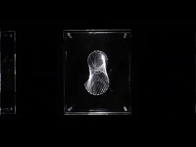
With this conceptual grounding, the design problem became: How do you embed hybridity into the structure of a letterform? How do you create forms that emerge through negotiation rather than resolution?
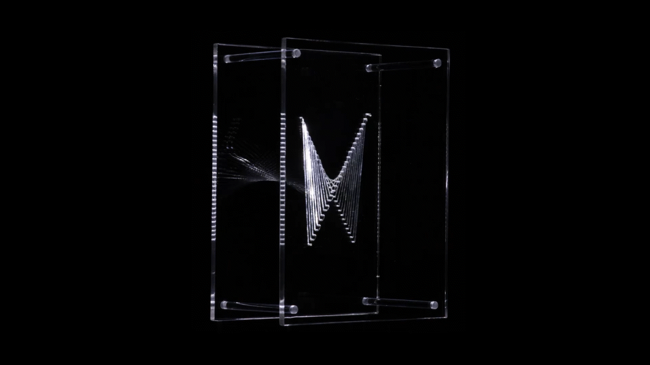
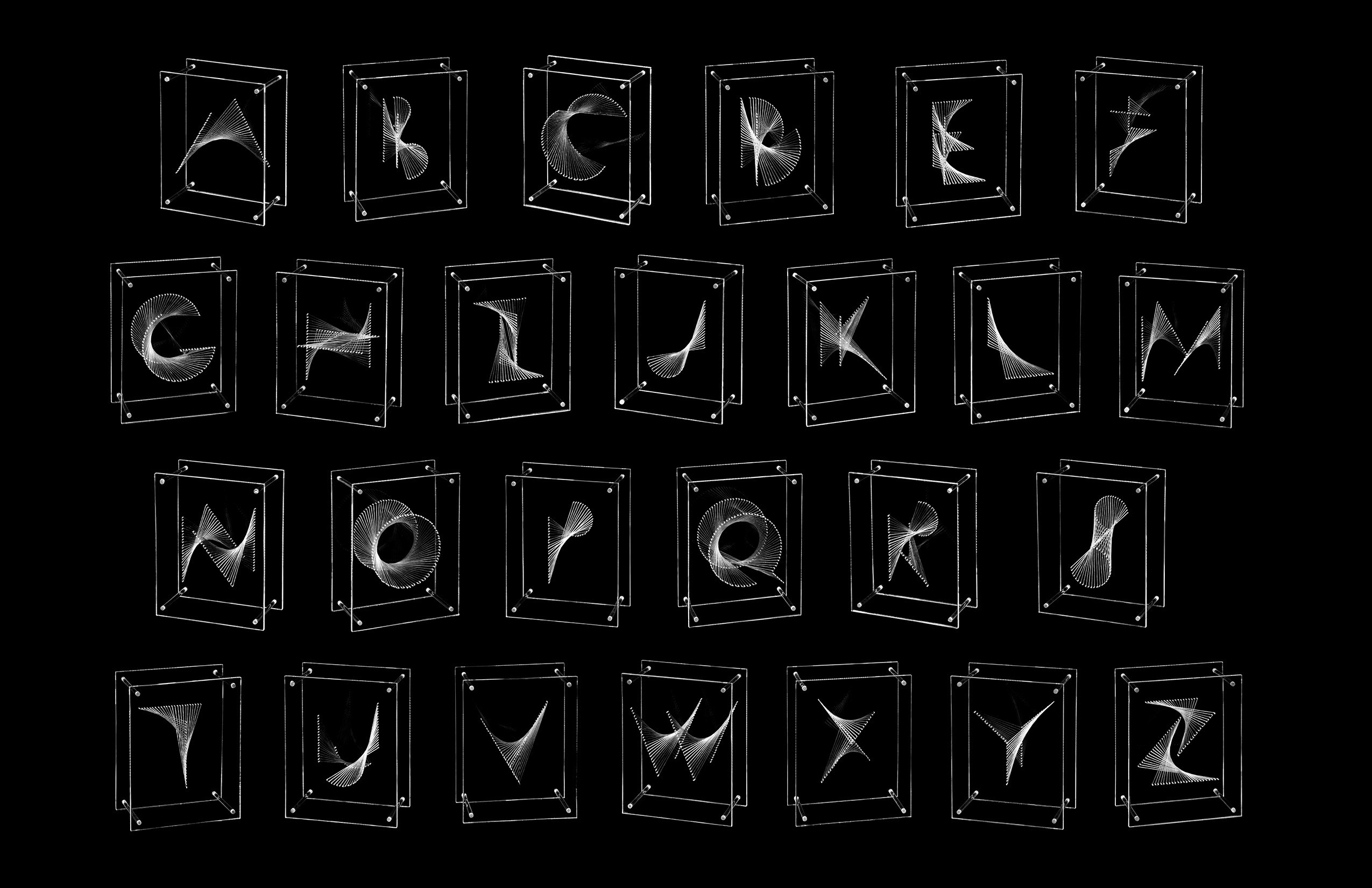
The architecture of Heterosis is built on two opposing planes, each carrying a vector that represents a distinct typographic binary. Rather than choosing between these binaries or blending them into a compromise, I designed the letterforms to appear in the third space between the planes. A third vector then weaves back and forth between them, pulling from each binary as it moves. It is this weaving—this act of crossing boundaries, inheriting from both sides, and refusing to settle—that forms the letter itself.
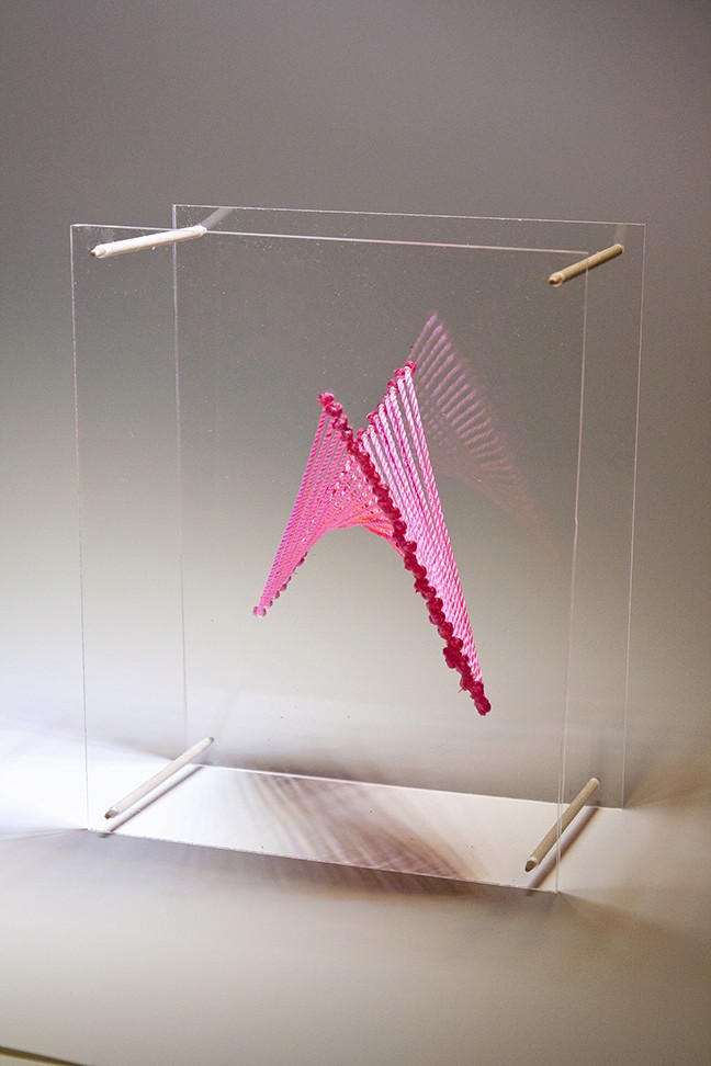
The letters are not static shapes but moments in a process. They inherit from multiple sources, reveal their internal tensions, and expose the negotiations required to form them. The resulting forms don’t resolve the differences between their parent structures; they illuminate them. This is where the essence of Heterosis lies: the letter emerges through motion, tension, and the creative force of in-betweenness.
By designing letters that materialize in the third space, Heterosis becomes a living model of hybrid identity—one that refuses purity, embraces complexity, and finds form in the act of weaving difference together.
8. Closing: A Typeface That Performs Identity
In the end, Heterosis became more than a design project. It became a way to process my own experience—of growing up between cultures, navigating shifting expectations, and searching for representations that mirrored my reality. The typeface doesn’t resolve the tensions between its binaries, just as I’ve never resolved mine. Instead, it makes them visible. It acknowledges that identity is not fixed but constructed, negotiated, and continually reshaped.
Returning to this project after years in professional practice has reminded me that design is most powerful when it emerges from personal truth. Heterosis showed me that typography can be a space where cultural theory, personal experience, and formal experimentation converge—where design becomes both an analytical tool and an expressive medium.
A typeface alone can’t capture the full complexity of mixed identity. But it can illuminate the structures that shape it, the boundaries that constrain it, and the creativity that emerges when those boundaries are crossed. In that sense, Heterosis is less a conclusion than an invitation—to see identity as fluid, relational, and always in motion. And perhaps, to imagine design as a space where hybridity can finally be seen, understood, and celebrated.
Other Articles


