
Heterosis
3D Kinetic Typeface Exploring Hybrid Identity
Heterosis is an experimental kinetic typeface developed in 2010 as part of Brian Banton’s Master of Design thesis at York University.
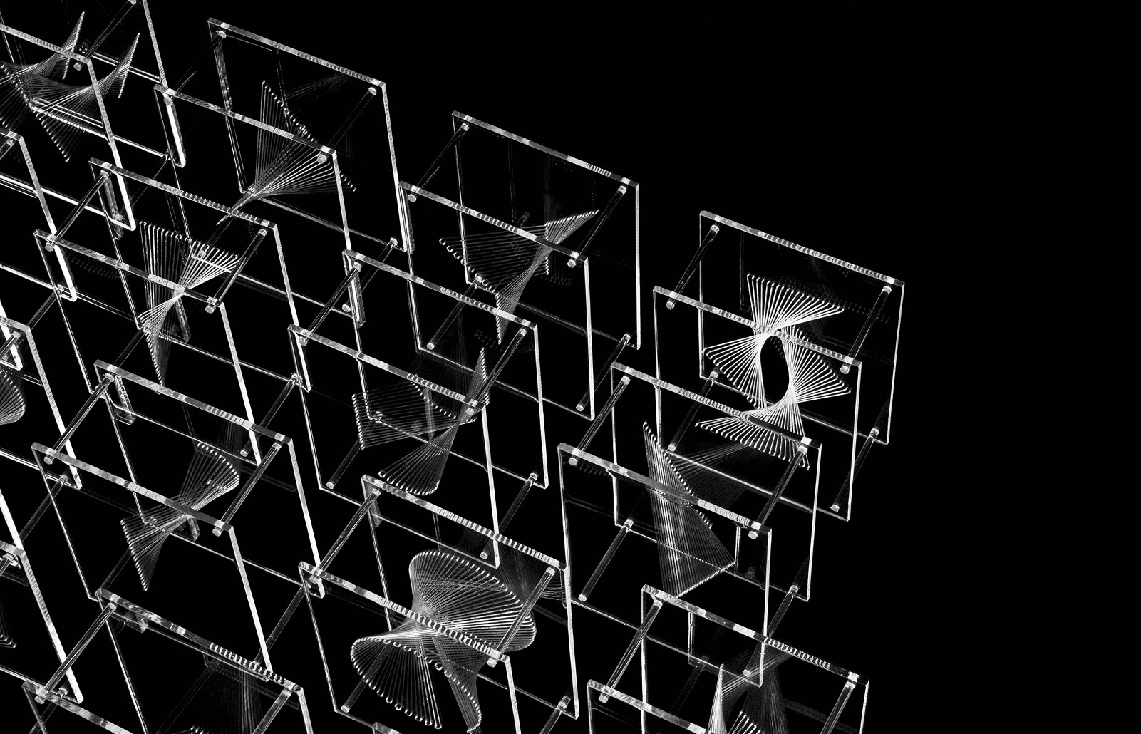
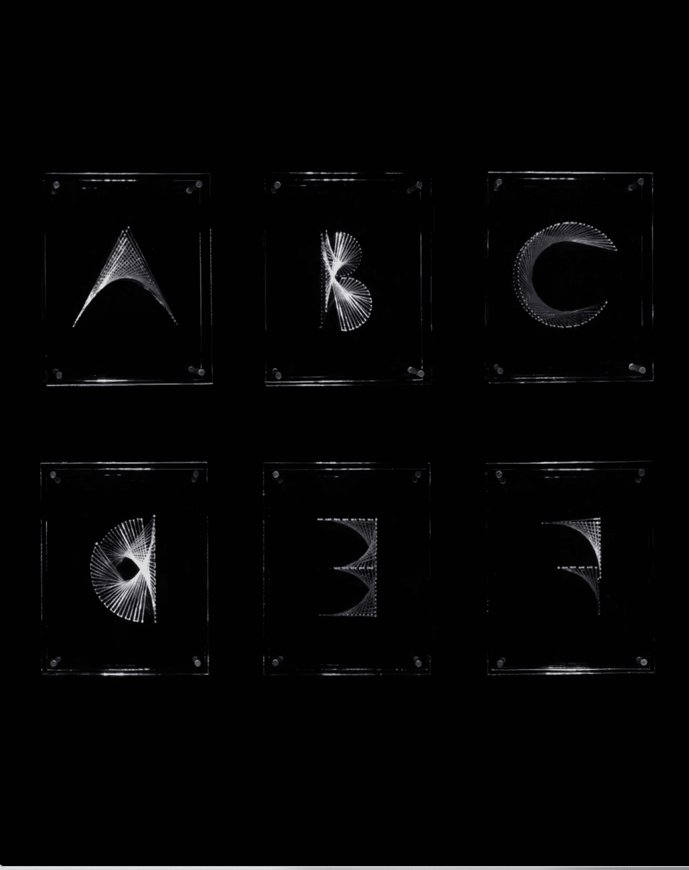
Constructed from transparent acrylic and elastic, each letter exists as a three-dimensional form captured in motion. Characters were photographed in 60 incremental rotations, creating looping sequences where the letterform continuously shifts, never settling into a single fixed state.
At its core, the project explores hybridity through typography. Each character is formed by blending two linear structures across a spatial plane, producing a third form that exists between them. The result is a typeface that is not static, but continuously negotiating its own shape.
For a deeper look into the thinking behind the work, read the full essay on our blog:
Services
Typography
Spatial Design
Kinetic System
Motion Design
Physical Prototyping
Kinetic System
Digital Assets
Social Templates
Art Direction
Year
2010
Heterosis
3D Kinetic Typeface Exploring Hybrid Identity
Details
Heterosis is an experimental kinetic typeface developed in 2010 as part of Brian Banton’s Master of Design thesis at York University.
Constructed from transparent acrylic and elastic, each letter exists as a three-dimensional form captured in motion. Characters were photographed in 60 incremental rotations, creating looping sequences where the letterform continuously shifts, never settling into a single fixed state.
At its core, the project explores hybridity through typography. Each character is formed by blending two linear structures across a spatial plane, producing a third form that exists between them. The result is a typeface that is not static, but continuously negotiating its own shape.
For a deeper look into the thinking behind the work, read the full essay on our blog:
Services
Typography
Kinetic System
Spatial Design
Motion Design
Physical Prototyping
Spatial Design
Digital Assets
Social Templates
Year
2010
Heterosis
3D Kinetic Typeface Exploring Hybrid Identity
Details
Heterosis is an experimental kinetic typeface developed in 2010 as part of Brian Banton’s Master of Design thesis at York University.
Constructed from transparent acrylic and elastic, each letter exists as a three-dimensional form captured in motion. Characters were photographed in 60 incremental rotations, creating looping sequences where the letterform continuously shifts, never settling into a single fixed state.
At its core, the project explores hybridity through typography. Each character is formed by blending two linear structures across a spatial plane, producing a third form that exists between them. The result is a typeface that is not static, but continuously negotiating its own shape.
For a deeper look into the thinking behind the work, read the full essay on our blog:
Services
Typography
Spatial Design
Kinetic System
Motion Design
Physical Prototyping
Year
2010


Process
Process
The project began as a conceptual question: how can typography represent identity as something fluid rather than fixed?
Drawing from research into racial representation, hybridity, and cultural theory, the typeface was designed to operate within a “third space” where opposing structures coexist. Instead of resolving differences, the system holds tension between them.
Each letter is constructed from two underlying vectors positioned across separate planes. A third vector moves between them, weaving and inheriting from both to generate the final form. The letter emerges through this interaction, rather than being predefined.
Physically, the typeface was built using transparent materials to emphasize light, overlap, and depth. Every character was photographed frame by frame at six-degree intervals, translating spatial form into a continuous motion loop.
The process blurred boundaries between graphic design, sculpture, and time-based media. Typography became less about fixed shapes and more about behavior, transformation, and emergence.

Outcome
Outcome
The final result is a kinetic typeface that performs hybridity rather than simply representing it. Each letter exists in flux, revealing its structure through motion and making visible the tensions that define it.
Heterosis reframes typography as a living system. Forms are not resolved or static, but constructed through continuous negotiation. The work sits at the intersection of design, theory, and personal narrative, bridging academic inquiry with material experimentation.
Originally created as a thesis project, Heterosis has since been recognized across a number of leading design award shows:
—Graphis New Talent Annual: Gold
—Coupe Magazine: Winner
—Advertising & Design Club of Canada: Merit, Silver
—Art Directors Club, New York: Silver
—I.D. Annual Design Review: Winner
—Adobe Design Achievement Awards: Winner
—Applied Arts Magazine: Winner
More than a study in form, the project continues to resonate as an early exploration of themes that remain central to our practice today: identity, systems, and design as a tool for making complexity visible.
Next Project

Tyranny Tracker
Human Rights & Policy
Next Project
Tyranny Tracker
Human Rights & Policy
Next Project

Tyranny Tracker
Human Rights & Policy