
Tom Ellicott
Legal
Details
Dotting i’s, crossing t’s — and setting a new legal standard
Melbourne-based barrister Tom Ellicott approached us with a clear vision: to establish a refined and contemporary brand that would set him apart in a traditional field. He wanted an identity that reflected his reputation for integrity, precision, and thoughtful practice—while still feeling understated and modern.
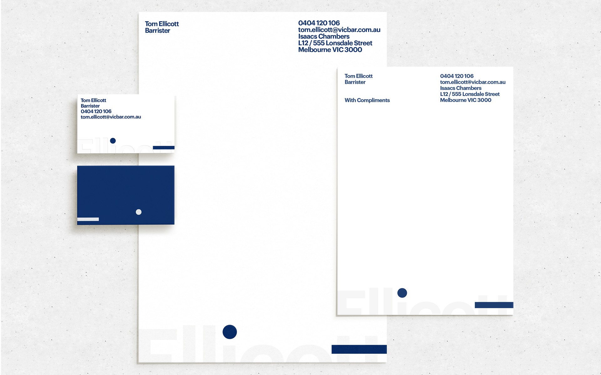
Inspired by the expression “dotting your i’s and crossing your t’s,” we built a system that quite literally draws meaning from his name. The visual identity centers around these two letters—clean, direct, and quietly confident.
Dotting i’s, crossing t’s — and setting a new legal standard
Melbourne-based barrister Tom Ellicott approached us with a clear vision: to establish a refined and contemporary brand that would set him apart in a traditional field. He wanted an identity that reflected his reputation for integrity, precision, and thoughtful practice—while still feeling understated and modern.
Inspired by the expression “dotting your i’s and crossing your t’s,” we built a system that quite literally draws meaning from his name. The visual identity centers around these two letters—clean, direct, and quietly confident.
Services
Services
Brand Identity
Logo Design
Stationery Design
Year
Year
2024
2024
Tom Ellicott
Legal
Dotting i’s, crossing t’s — and setting a new legal standard
Melbourne-based barrister Tom Ellicott approached us with a clear vision: to establish a refined and contemporary brand that would set him apart in a traditional field. He wanted an identity that reflected his reputation for integrity, precision, and thoughtful practice—while still feeling understated and modern.
Inspired by the expression “dotting your i’s and crossing your t’s,” we built a system that quite literally draws meaning from his name. The visual identity centers around these two letters—clean, direct, and quietly confident.
Services
Brand Refresh
Logo Design
Stationery
Guidelines
Logo Design
Art Direction
Year
2024


Process
Process
We developed a typographic system that balances structure and restraint, with a graphic motif drawn from the dot and cross of the “i” and “t” in Ellicott. These minimal marks became signature elements, reinforcing the concept of care and precision across every touchpoint.
A deep navy and crisp white palette reinforces professionalism, while subtle typographic details and blind embossing add a layer of craft and control.

OUTCOME
OUTCOME
The result is a considered, quietly striking brand system—applied across stationery, printed materials, and digital templates. Elegant, efficient, and grounded in concept, the identity reflects Tom’s approach to practice: focused, exacting, and trustworthy by design.
Next Project

Music To Your Eyes
Arts & Culture
Next Project
Music To Your Eyes
Arts & Culture
Next Project
Music To Your Eyes
Arts & Culture